CANCELLERESCA, SCRITTURA. — In palaeography, the name c. designates the writing proper to chanceries, and in particular that of imperial and papal diplomas. Strictly speaking, it does not constitute a script in its own right, but rather a modification—carried beyond the limits of spontaneous development—of particular cursive and semi-cursive scripts that succeeded one another over the centuries. Nevertheless, certain specific characteristics, summarized in a solemn and elaborate penmanship, with an excessive extension of the strokes below and still more above the line, and with artificial ligatures, make it possible to distinguish it as a particular type of script.
The earliest example is provided by two imperial rescripts from the 5th century, originating in Egypt, both fragmentary: one preserved in the Museum of Antiquities in Leiden, the other in Paris, partly in the Louvre and partly in the National Library. The script is nothing other than a deformation of the Roman cursive minuscule, with evident influences from Greek c.; the letters display a characteristic inclination to the right.
The script of the imperial chancery, beginning with the Carolingians, reflects the documentary scripts in current use, continually accentuating their artificial character and showing a tendency to preserve their features even after the decline of the scripts from which it originated. Thus Charlemagne’s diplomas are still in Merovingian script (v.), that is, a script arising from the development of distinctly chancery elements that remain unchanged for a long time, even though the number of ligatures gradually decreases and the words now appear separated from one another
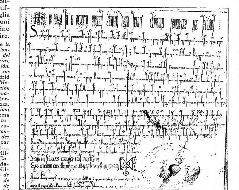
CANCELLERESCA, SCRITTURA — Diploma of Conrad III dated 28 May 1139. St Gall, abbey archives.
from one another. The letters b, d, h, and l have a very elongated shaft, slightly curved to the right, while p and q descend far below the ruled line. The influence of Carolingian minuscule, however, becomes increasingly evident, and already under Louis the Pious (814–40) forms are found that closely resemble this script: the letters are, however, narrower and taller, the a is still open, and the shafts are very pronounced. From the tenth century onward, the c. of imperial diplomas is essentially identical to Carolingian minuscule, but the tendencies proper to the chancery distinguish it from the script of codices in the development of long strokes, in the preciosity of the upper curves, especially those of f and s, and in certain characteristic ligatures, principally the group st, in which the letters, placed at an exaggerated distance from one another, are joined by an arch connecting the flourish of the s with the vertical shaft of the t. This type of script continued until the twelfth century, which may be regarded as the period of the c.’s greatest perfection. With the following century it came increasingly close to the script of codices, in which Gothic script now predominated. A particular type of c., the so-called “Italian c.,” is derived from humanistic cursive: although very widespread in Italian chanceries, it is not found in the imperial chancery.
The history of papal c. is different. It originated in Roman curial script, itself derived from the Roman cursive minuscule. It already appears fully formed in the oldest documents that have come down to us (eighth–ninth centuries): the development of the long strokes, both above and below the ruled line, is very pronounced; the a is open and has a form reminiscent of the omega of Greek minuscule; the e is circular, beginning at the upper right and closing somewhat below its starting point, with the two strokes crossing; the circle is often surmounted by a small eye; q has a characteristic appearance related to the majuscule; t likewise has a circular form, surmounted by a wavy horizontal stroke. In the eleventh century, the influence of Carolingian minuscule, which was also exerted in the papal chancery, although by a slower process than in the imperial chancery, brought about evident changes in the c. of the papal curia; the use of parchment, which replaced papyrus from the pontificate of Benedict VIII (1012–14), also contributed to them. In this second
phase, the c. became smaller; in the preceding period it had towered above the other letters (with the obvious exception of those with a shaft extending above the ruled line); g acquired a form with a rounded head; the final shafts of m and n generally had a curve at the bottom toward the right. This script survived until Paschal II (1099–1118), but Carolingian minuscule had already been introduced into the papal chancery under Clement II (1046–1047): indeed, one may note the different use of the two scripts according to whether the document was drawn up by a Roman or a foreign scribe. In the twelfth century, under Callistus II (1119–24), papal documents display a script that, alongside Carolingian forms, preserves certain characteristic elements of the ancient curial script (open a, and the si and ti ligatures); but already under his successor, Honorius II (1124–30), these survivals disappeared completely. The c. then became assimilated to Carolingian minuscule, while exhibiting characteristic deformations similar to those found in imperial diplomas (to which the typical ct ligature may be added). In the thirteenth century, the strokes began to appear thicker and less rounded, until cursive Gothic gave rise to bullatic script (v.).