GOTHIC, SCRIPT AND MINIATURE. — Toward the end of the 12th century, in the field of Latin scripts, the Carolingian minuscule was replaced by a script which, setting a harsh and angular pen-stroke against the rounded forms and classical elegance of the “littera antiqua” (Carolingian), was recognized by the humanists as “barbarous” and therefore came to be called Gothic, with the same derogatory meaning attached to this designation as to the epithet applied to that particular architectural style which, during the same period, was triumphing over the Romanesque. The new script soon breaks up
I. ORIGIN
The origin of g. has not yet been sufficiently clarified: it may nevertheless be said that it is the result of a process of stylization which fixes, in forms particularly consonant with the taste of the period (one need only think of architecture), a ductus born of a calligraphic effort, that is, from the need to preserve artificially the calligraphic appearance of a script which, because of its agile and rounded penwork, was tending imperceptibly but inevitably toward cursive forms: indeed, the first symptoms can already be discerned in certain manuscripts of the 11th century. To what extent a presumed influence of Beneventan (v.), as maintained by the Russian scholar O. Dobiache-Rojdestvensky, acted upon the formation of g. cannot be established. Certainly, however, the exclusive use of the pen as a writing instrument contributed to determining its form (especially as regards the alternation of thick and thin strokes), as did the spread of culture beyond monastic centers: near the universities, in response to the need to disseminate study texts in large numbers, scriptoria in fact arose whose copyists worked with an exclusively commercial purpose (v. PECIA) and, especially at first, lacked a school tradition; consequently, calligraphic writing, being unfamiliar to them, necessarily became rigid and artificial. It is probable, though not yet demonstrated, that g. originated in northern France, but it spread rapidly throughout western Europe and remained in use until the 15th century. In the Germanic countries it has lasted to the present day.II. BOOK HAND GOTHIC
A systematic classification of the various types of minuscule Gothic script has yet to be made; the following list is therefore limited to those that are more clearly defined and commonly recognized.The type in which the distinctive elements of Gothic script are most pronounced is found in missals and liturgical texts intended for recitation in choir, in which the need to make reading easy despite the distance between the lectern and the stall led to the use of conspicuous characters, with a completely artificial ductus: this is the so-called choir Gothic, also called Fraktur by the Germans and lettre de orme by the French. It is also found in literary texts, especially in
Germanic countries, but ordinarily in reduced proportions, and is then designated by the name textura (Text). In Italy, the breaking of the lines, the hardness of the stroke, and the emphasis of the angles are kept within more modest proportions, and the writing always retains a certain roundness in its penwork; hence Italian Gothic was also called rotunda: its most characteristic expression is found in the Bolognese university manuscripts (littera Bononiensis). French Gothic artificially develops
(property of Enc. Cutt.)
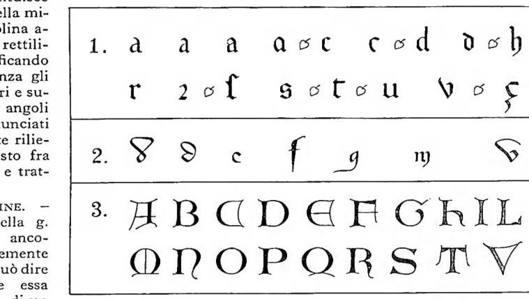
GOTICA, SCRITTURA E MINIATURA — Characteristic letters of the preceding section
All these types have in common an angular appearance and a broken ductus, which is sometimes limited to the separation of the connecting element from the principal stroke, while at other times (especially in m, n, u) it affects the strokes themselves, executed in two movements. The a (cf. table, no. 1) is initially of uncial type, with the right-hand stroke rigid; in the 13th century it begins to display a crown at the top, which in the following century closes into a loop, so that the letter consists of two arches, resting on the right against the principal stroke; in ligature, a often retains the traditional minuscule form, but with straight lateral lines and highly accentuated arches. The c has an appearance similar to that of e and t; except that e closes its crown with a light oblique stroke joining it to the stem, while t has a principal line projecting slightly above the crossbar; in the 14th century c is sometimes drawn without the lower curve that closes the vertical stroke. The minuscule d gives way, especially from the 14th century onward, to the uncial-type d, which is preferably used before rounded letters (a, e, o, or also “round” r). The h has a rigid right-hand stroke up to the height of the line, then curves inward, descending increasingly below the principal stem. From the 14th century i acquires the diacritical sign even when isolated: in the 14th century the dot begins to appear. The r has a straight form (minuscule) and a round form (improperly called “Gothic”): the latter derives from an uppercase-type r joined in ligature with letters that close on the right with the same curve as o (b, round d, g, p); later, once awareness of its origin had been lost, it persisted as a second form of r, but continued normally to occur in combination with rounded letters. The s likewise has a straight and a round form, the latter occurring particularly frequently at the end of a word. The u may have an acute form (v), but the different spelling does not correspond to a difference in sound. The z is sometimes replaced in Italian manuscripts by the tailed c (c), which seems to derive from a particular formation of the z, with two arches running in opposite directions and joined by a thin oblique line. Gothic script also had its own uppercase alphabet (cf. table, no. 3), used especially for the initial letters of books and chapters. Abbreviations, particularly from the 14th century onward, became extremely numerous. From the study of ligatures in various manuscripts
(phot. Enc. Cutt.)
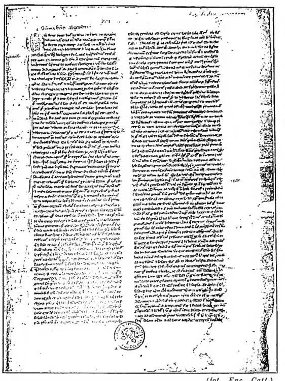
GOTICA, SCRITTURA E MINIATURA - Incipi of part 1 of the Summa of Alessandro di Hales (1235–55) - Vatican Library, cod. Vat. lat. 701, f. 3r.
From a study of the ligatures in various manuscripts of the 13th–15th centuries, Meyer sought to identify certain laws concerning principally the overlapping of the curves, respectively on the right and left, of two letters that come to stand next to each other, and the use of the “rounded” r (v. SORA); it must nevertheless be borne in mind that these are merely rules admitting of very many exceptions.
III. CURSIVE GOTHIC
In Gothic script, the cursive form is clearly distinct from the minuscule: it does not derive from the latter as the result of freer penwork, but develops directly from Carolingian script during the thirteenth century, increasing its connecting strokes, enriching its ductus with flourishes, and considerably reducing the time required for its execution. Cursive Gothic already displays the characteristics of modern running script: letters inclined to the left or, more often, to the right; continuous penwork throughout the length of a word; and the linking even of the long upper and lower strokes, which at first are angled in one direction or the other, or finally brought back to their point of origin after describing a loop that widens upward or downward and closes on the ruled line.It is a script in common use (letters, drafts, registers), but it is also widely employed in chanceries and is not foreign to book use. Here too there is a great variety of types, but all exhibit certain fundamental characteristics, above all the rounded appearance that cursive Gothic always preserves in contrast with the minuscule, since certain angular breaks are incompatible with the need for rapid and light execution. Widely used also for literary texts, especially in France, is the so-called bastarda, a chancery type, with regular and inclined ductus, its long lower strokes greatly thickened at the point of origin and pointed at the bottom. With slight differences in penwork, it is also found in Germany, England, and Spain (bastardilla). The chancery minuscule is a highly elegant rounded script, in which the connecting strokes in particular are embellished in the curial manner: it originated in Italy and was also used for codices, especially in the vernacular; but it is above all characteristic of the papal chancery from the end of the thirteenth century through the whole of the fourteenth. From it, through a more rapid and less formal execution, derives the mercantile minuscule, used for private documents and account registers. As regards the individual letters (cf. table, no. 2), it will suffice to recall that a never occurs in the uncial form found in the Gothic minuscule; d is rarely upright, more often rounded, in two forms: its shaft either bends back toward the right from its farthest point and closes upon the loop with a thin oblique stroke (as in the chancery minuscule), or is drawn directly onto the loop in a single elliptical stroke; e often has an open hook in place of the eye; f descends below the line—as does r, when it is not rounded, at the end of a word; the lower stroke of g, instead of closing to form a belly, not infrequently ends in a long horizontal flourish from right to left; m and n often have their final leg descending below the line; n in the pointed form (at the beginning of a word) has its left stroke much higher and crowned by a flourish from left to right, while the right stroke often closes inward.
IV. GOTHIC ILLUMINATION
When speaking of Gothic illumination, one must naturally set aside the illustration of fifteenth-century texts which, although in many cases written in Gothic script, reflect Renaissance art in their decoration: more properly, one should speak of the illumination of the twelfth to fourteenth centuries, excluding, however, that of Beneventan origin (v.) which had a different origin and its own characteristics. In the critical examination of the decorative elements of the manuscript, one must distinguish during this period, even more than in the Carolingian age,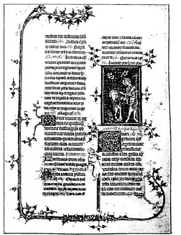
The former develop, especially in the 12th century, already traditional tendencies, enriching the foliate ornament and fantastic figures around the initials; in the 13th century, the tendency to embellish the pages also with marginal decorations (strips and geometric compositions in strong colors, or floral interlacings) becomes increasingly marked. These find their finest expression, with differing characteristics, in the Bolognese legal texts and in the French «books of hours». The illustration, on the other hand, which often occupies even the central part of the large initial letters, gradually frees itself from Byzantine influence and increasingly approaches the pictorial composition of canvases and frescoes, especially in the 14th century, when the background too definitively abandons conventional schemes and comes alive through the reconstruction of realistic landscapes and interiors. At times the figures, animated by a vividly human expression even when they possess an allegorical significance, crowd together, completely overwhelming the background: the page then blazes with the contrast of the reds, blues, and greens of the drapery, in warmer tonalities, and only a delicate architectural frieze or a succession of small columns provides the schematic framework of the scene. We are in the period of the greatest splendor of illumination, which, although it still addresses itself preferably to sacred texts, completely abandons the hieratic character of the figure and suffuses the picture with every kind of light, more or less strong but always vivid, without dull tones, whether it draws its inspiration from the compositions of Sienese and Florentine painters or repeats the motifs of the windows in Gothic cathedrals. This development is furthered by the fact that ornamentation, like writing, is by now no longer the exclusive product of monastic centers, but becomes principally the expression of lay schools, of artisans working under the direction of a master who imposes a personal style on the work: Oderisi da Gubbio, celebrated by Dante, Niccolò di Giacomo, of the Bolognese school, Lorenzo Monaco, a Florentine master, Giovannino de' Grassi and Belbello di Pavia, of the Lombard school; the French artists Honoré, Jean Pucelle, and the anonymous «Master of the Bushes», and the decorators of the Anglo-Saxon school of Norwich, no longer understand illumination as a mere embellishment or as a minor art, but make it a mode of expression of the great pictorial art, and the pages produced in their workshops have nothing to envy in the most celebrated works of the 15th and 16th centuries. - Vedi tav. LXXII.