CAPITALE, SCRITTURA. -
I. IN EPIGRAPHY
Applied to writing, the term « c. » means « larger », « more conspicuous », as were the letters customarily used in the capita of pages and treatises. It is not a word used in ancient Latin. In technical language, however, it is not synonymous with « majuscule », but designates that form of writing which appears on the most ancient stone monuments and is still essentially reproduced in the capital letters of modern printing. In this sense it is opposed both to cursive and to minuscule writing, and also to uncial.It seems that in ancient times a single type of writing was in use among each people, both Greek and Italic, with an alphabet that the Greeks derived from the Semites and the Italic peoples from their Greek neighbours in the Chalcidian colonies (Cuma, Napoli, etc.). Certainly, all the most ancient written texts display the same type of letters, which are essentially those referred to above as capitals.
Greek c. shows little evolution in its forms, and has almost exclusively the rounded variants, as opposed to the square forms, from as early as the 3rd–2nd centuries B.C.; these forms might be called uncial.
Latin c., from its most ancient form (archaic c.), gradually refined its strokes, so that by the time of Augustus it presents us with a noble, at once severe and elegant type, in which the forms of the letters are perfectly stabilized. This type has two fundamental variants: square or monumental, and actuary or rustic c.
Square writing has very broad letters, with perfectly horizontal or vertical straight strokes, so that each one can be inscribed within a perfect square or rectangle. It was regularly used on monuments and marble slabs, in mosaics, on stamps and seals, in the headings of books, and wherever the writing was to display a particular monumental character. It was especially suited to incision with a chisel.
Actuary or rustic c., by contrast, is characterized by narrower and more elongated forms, by the tendency of horizontal strokes to slant upward, by the depression and partial deformation of all curved strokes, and by the frequent abandonment of the vertical in favour of the inclined. As such, it was particularly suited to writing with pen and brush, and was perhaps chiefly produced by the use of these instruments. It is therefore obvious that it was ordinarily used for recording public and private acts, whence its name of actuary. The force of custom was so great that even when these acts had to be engraved on hard material, such as bronze or marble (imperial rescripts, acts of the Arval Brethren, etc.), they were written in rustic.
For the rest, the two forms did not always remain entirely distinct. In less carefully executed writings on marble, rustic forms often occur among the square ones; in the 3rd–4th centuries, moreover, and particularly in Christian epigraphy, square and rustic letters are continually mixed, indeed, as calligraphy progressively deteriorates, the entire inscription takes on an increasingly rustic appearance.
With his calligraphic reform, Pope Damasus attempted a determined return to the purest forms of square c., exaggerating somewhat further their characteristics of breadth and severity; but this was an action that had little effect during or after his time.
Latin c. in its formal form has remained almost unchanged on monuments down to our own day.
The cursive form (cursim ducta, that is, rapid) must always have been used, once people began to write outside monuments, for the more ordinary needs of life. It therefore seems also to have undergone a development of its own, independent of that of c. In fact, when it first begins to appear, it bears the marks of archaism and popular usage.
It is essentially the same c. writing, but traced quickly and without much care. Thus the elements of a single letter are often separated from one another, while, still more often, the elements of two successive letters are joined; many apices are excessively elongated, and the whole writing readily inclines to the right. Much of the cursive’s character is also determined by the instrument with which it is written and by the surface receiving the writing. In general, right angles are avoided, and curves tend to lessen their depth and open out. Many uncial and minuscule elements are also introduced into the forms of the letters. In any case, there is not a single type of cursive alphabet; according to time and place, there are considerable variations, and indeed it may be supposed that at times the strongest variations are due to the incompetence of the writer and to the resistance of the surface on which the writing is made.
Cursive was regularly used in private documents and in brief personal inscriptions, preserved for the most part on wax tablets and scratched on walls by visitors. The letters in it that depart most markedly from the capital are a, b, d, e, h, q, r, s.
II. IN PALEOGRAPHY
In parallel with lapidary script, a book capital script also developed from the archaic capital script, which is exclusively epigraphic; three types of book script may be distinguished: rustic, elegant, and cursive.Some treatise writers recognize a direct derivation from archaic capital script only for the latter type, whereas book capital script properly so called, both rustic and elegant,
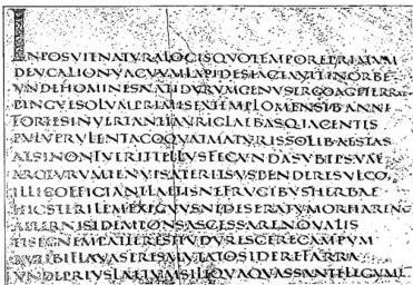
(from F. Steffens, Paleographic latina, French edition by R. Coulson, Paris-Treasury 1918)
CAPITALE, SCRITTURA – Elegant c. – Vergilius Augusteus (4th century), Vatican Library, cod. Vat. lat. 3236, f. 1, Georg. I, 67 agg.
would thus be the continuation of lapidary c. But certain elements (the absence of the middle stroke in the A of rustic c.; the rising above the line of the vertical strokes of some letters; certain characteristic forms that have no counterpart in the epigraphic field; and the continuous character of the script in an age when inscriptions show a dividing element between word and word) reasonably suggest a parallel process rather than one of dependence, although in particular cases a reciprocal influence cannot be excluded. Indeed, in certain forms of actuary c., the contrast between thickened and thin strokes, the undulating ductus, etc., lead one to recognize a conscious imitation of book script by lapidary script, and not the reverse.
Elegant c. is the palaeographical counterpart of square c. in inscriptions: today it is more commonly regarded as having been influenced by the epigraphic forms of the Damasian renaissance than by the lapidary script of the 1st century. The very few examples that have come down to us (several Virgilian codices, all mutilated: the Augustan codex, partly in the Vatican Library [Vat. lat. 3256; 4 leaves] and partly in the State Library of Berlin [2°, 416; 3 leaves]; the Sangellese [1394; 11 leaves]; the papyrus of Oxyrhynchus [Oxyt. Pap. 1098] and perhaps the Veronese palimpsest [XL, 38; 51 leaves]) do not date from earlier than the 4th century (it should be noted that the scanty fragments of Herculaneum papyri, which seem to provide an example of it, are so mutilated that it is not even possible to pronounce with certainty on the type of script). It is nevertheless thought to have been in use in earlier periods as well. The ratio between the width and height of the letters in its alphabet is such that the broad letters (B, C, D, G, M, O, Q, etc.) can be perfectly inscribed within a square, while the thickened parts of the rounded strokes are drawn along an axis perpendicular to the line (v. I). It is a solemn script, of a distinctly calligraphic character and rather limited use: in the Middle Ages, after it had ceased to exist as a spontaneous form, it continued to be used as an imitative script in titles, rubrics, and glossary headwords.
Rustic c. corresponds in the book-script field to actuary c. in inscriptions. Compared with elegant c., its letters have a greater development in height and can consequently be inscribed within a rectangle, with the shorter sides running in the same direction as the line; the thickened parts follow an axis that falls obliquely across the line, forming the smaller angle on the left (v. TABORITI). It has freer movements than elegant c., with horizontal strokes often undulating or sometimes even describing a flourish (P, L, more rarely T). The name simply indicates a distinction from elegant c., in comparison with which it appears less solemn; it by no means denotes coarseness of form or execution, since rustic c. too is an extremely careful script and was used in luxury codices. Already in use in the 1st century of the Christian era (its earliest examples are found in the Herculaneum papyri), it was the normal script of codices until the 4th century and remained the book script par excellence throughout the 5th century, when uncial and half-uncial began to prevail. It nevertheless survived for another century as a spontaneous form, and thereafter continued to be used occasionally, especially for titles or the opening lines of fine codices, as an imitative script: perfect examples are particularly frequent in the 9th century. The manuscripts listed by Lehmann number 27, four of them on papyrus: especially famous are the Virgil codices of the Mediceo-Laurentian Library (XXXIX, 1), Vatican (Vat. lat. 3225), Roman (Vat. lat. 3867), and Palatine (Vat. Palat. lat. 1631); the “Bembine” codex of Terence (Vat. lat. 3226); the Paris codex of Prudentius (Paris. lat. 8084); the Ambrosian palimpsest of Plautus (G. 82 sup.); and the Turin codex of Sedulius (E. IV. 42).
Cursive c. is the documentary script of the classical period, in which letters of c. type are traced with a cursive ductus, rarely joined by ligatures and more often in nexus. The name is not used consistently by all treatise writers to designate this script, which is variously called Roman cursive, ancient cursive, ancient Roman cursive, and sometimes even cursive majuscule. Schiaparelli goes so far as to distinguish a cursive c. from a cursive majuscule, using the latter name for a mixed script whose letters, overwhelmingly majuscule, tend to depart from the original c. form in order to assume other forms derived from it through spontaneous evolution. Rather than constituting a type in its own right, however, cursive majuscule represents a transitional form leading to cursive minuscule, whose characteristics are determined by a dual tendency: toward minusculization and toward greater cursiveness. Cursive c. is documented in the Herculaneum and Egyptian papyri and in the wax tablets of Pompeii and Dacia. Although the formation of the letters is the same in both the former and the latter, the general appearance of the script is entirely different, owing to the difference in material and writing instrument (v. tab. III). In the papyri it is more supple, rounder, and richer in ligatures; on the tablets, uneven, hard, and disconnected, in both cases eventually assuming distinctive forms of its own.
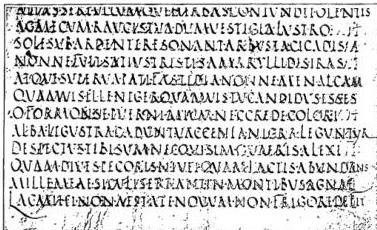
(from F. Steffins, Paleographic lattice, French ed. by D. Gaulois, Paris-Trevini 1918)
CAPITALE SCRITTURA - C. rustica. Virgilio romano (sec. V-VI). Biblioteca Vaticana, cod. Vat. lat. 3867, f. 4, Ecl. II, 11 sgc.
Quanto ai criteri di datazione della s. c. si può dire che fino ad oggi essi manchino del tutto: i vari tentativi che sono stati fatti si basano soltanto su elementi esterni alla scrittura, e si sono spesso rivelati precari. La scarsezza della documentazione, lo stato mutilo dei codici pervenuti sino a noi, l'assenza di elementi che consentano di riconoscere il luogo di provenienza, non hanno permesso di formulare dei principi cronologici nel campo librario. Anche per la c. corsiva manca uno studio sufficientemente approfondito sulla sua evoluzione, ma poiché i testi documentari sono quasi tutti datati o databili con molta approssimazione, si potranno fissare criteri sicuri quando tale studio sarà fatto.