INSULAR SCRIPT AND ILLUMINATION. - The Latin script of Great Britain between the 7th-10th centuries and of Ireland between the 7th-12th centuries is today designated as a whole by the name insular, first given to it by L. Traube: it must be placed among the national scripts, but it has an origin and development different from the others. Moreover it also extends, naturally undergoing various influences, to the continent, in the monastic centers that the evangelical activity of the Irish and Anglo-Saxon monks scattered in France, Switzerland, Germany, and Italy. The insular script properly so called is substantially divided into two types: a round script and a minuscule; the intermediate type,
| 1. | α=a; b=b; σ=d; Γ=f; L=f; H=n; |
|---|---|
| 2. | u a a α=a; θ=e; ρ=p; ν=r; ν=s; |
| 3. | δ=θ; ρ=w; 4. Α=a; θ=h; Σ=σ; |
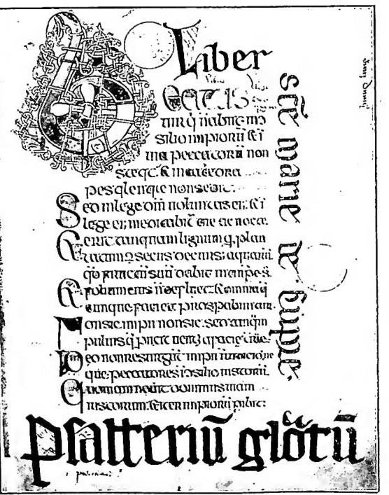
INSULAR, SCRIPT and MINIATURE - Characteristic letters of the insular script.
which Steffens calls "semi-round" (halbrunde irisch-angelsächsische Schrift), is rather a transitional form.
I. ROUND
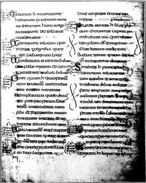
It is the oldest type of insular script (7th-8th centuries), which immediately follows an imitative phase in which the classical Roman forms (especially uncial and half-uncial) are repeated, forms that penetrated into Ireland and Great Britain with Christian evangelization. It was long believed that the land of origin of the new forms was Ireland and that from there they spread also among the Anglo-Saxons: today the opposite idea tends rather to prevail, but substantially the problem remains open. One can only state with certainty that the insular round script derives from uncial and half-uncial and thus presents itself as a mixed script, in which, however, the projecting strokes are so reduced as to allow even letters of minuscule form to be almost always contained within a bilinear system: hence the improper name of "insular majuscule." The round ductus constitutes its fundamental distinctive element, but the most characteristic sign is represented by a triangular finial ("wolf's tooth") that bounds at the top toward the left the long vertical shafts and sometimes also the short ones (i, n): owing to the influence of runic writing, it is handed down also to the insular minuscule. Among the individual letters (cf. table, no. 1) the following should be noted: the a, formed by two curved strokes, of which the left one is thicker and closed in a loop over the right one; the b of minuscule form, with the left shaft short and slightly bent and the bowl very wide; the d almost always of uncial form, with the upper shaft strongly bent to the left, almost parallel to the line; the f of majuscule form but in minuscule position, with the lower horizontal stroke resting on the line and the vertical shaft descending below it; the l with a wavy shaft; the n often majuscule, with the middle stroke almost horizontal.
A distinction between the insular round script of England and that of Ireland is not paleographically possible, and perhaps not even justified, although Irish products are generally recognized as having a more angular and less regular stroke.
II. INSULAR SCRIPT AND ILLUMINATION MINUSCULE
With the 8th century a form of minuscule script gains the upper hand whose origin has not yet been sufficiently clarified, but which must in any case be recognized, at least in part, as the result of a new fusion of those elements that appear in the round script, in order to satisfy the need for a simpler and faster execution: so much so that its use is at first limited to documents, though without ever attaining truly cursive forms, and only with the 9th century does it triumph also as a book script. It is rich in ligatures; it presents letters developed in length rather than in width, with very angular strokes, with the descenders closing to a point. At first it preserves some uncial elements, above all the round r, but in the period of its greatest development only the d of this form is still found. Characteristic letters are (cf. table, no. 2): the a of cursive type (open) or else closed in three different forms: with the loop bounded above by an oblique and rigid stroke from left to right; with the loop bounded by a horizontal upper stroke; with the loop curved but lower than the vertical right stem; the e which in ligature projects above the line; the p with the bowl open and ending in a thick dot; the r with the left stem descending below the line, and the complementary stroke much elongated downward; the z in which the upper curved line stiffens into two broken strokes, the first oblique ascending, the second, thicker, vertical descending. Other signs are also encountered (cf. table, no. 3) to express the sounds th and w: the first is rendered with a uncial d cut by an oblique stroke, and, later, with the runic sign of doru (= d); the second with the runic sign of vcn, very similar to a Latin p. The influence of runic writing also manifests itself in a particular majuscule alphabet, used above all for titles (cf. table, no. 4).
In insular minuscule the distinction between Anglo-Saxon and Irish is more pronounced than in the round script; the former has a freer movement and broader curves, the latter is instead rigid, angular, with strong contrasts, with less development of the long strokes. This aspect of it becomes even more accentuated with the 11th century, when in England the Norman conquest suppresses every remnant of insular script, which instead survives in Ireland in more swollen and stereotyped forms, still used today for Gaelic texts.
Abbreviations. - Without entering into the heart of the discussion concerning the origin of abbreviations of the insular type and their relations of dependence on those of the continent, it should nevertheless be recalled that in the texts of the British Isles abbreviations derived from the Tironian system and from the notae iuris abound, some of which are then also encountered on the mainland (v. ABBREVIAZIONI). Certain characteristic compendia are also frequent (per, pro, propter, proprius, quam, quia, quis, et reliqua, etc.) that have no counterpart in the other Latin scripts.
III. INSULAR SCRIPT AND ILLUMINATION
In the codices of England and Ireland the miniature presents characteristics strongly different from those of other countries: nevertheless recent studies (Masai) have shown that these are not original Celtic elements, but rather motifs already known, employed in goldsmithing and transported, first to England
(Int. Enc. Catt.)
INSULAR, SCRIPT AND MINIATURE
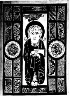
Round insular script. Gospel book of the 8th century - Vatican Library, cod. Barb. lat. 570, f. 40².
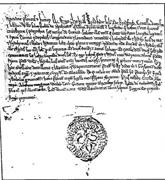
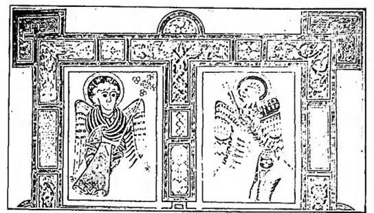
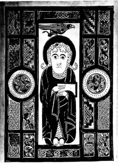
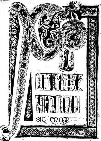
and then in Ireland, in miniature painting. This must be said above all for the decoration, which predominates by far in insular manuscripts and manifests itself in complex interlacements, geometric friezes around and within the initial letters, red dots that outline the first element of each paragraph. The ornamental element is often composite, distributed over the whole page with a patient study of schemes and proportions; the animated figure itself (man or beast), always drawn with crudeness, takes on a fantastic, grotesque appearance and remains limited to a purely decorative function. The color is generally dark, particularly in the Irish texts: in the Anglo-Saxon ones the page is sometimes enlivened with gold. These characteristics then variously exert their influence also in certain centers of the continent. But with the 9th century Carolingian art penetrates the English schools, especially from Reims; the new direction finds its most complete expression in the monastery of Winchester.
Among the most conspicuous products of insular miniature painting are the Lindisfarne Gospels, the Codex aureus of Stockholm, the Book of Kells. - See pl. VIII.
Bibliography11 works
Alessandro Pratesi