VISIGOTICA, SCRIPT AND MINIATURE.
- It is generally classified as Visigothic the Latin script used in Spain from the seventh–eighth century to the twelfth century: this definition must nevertheless be further clarified, in the sense that the name Visigothic should be attributed to the minuscule scripts (cursive and round) of the Iberian Peninsula at that stage of their development in which their local characteristics, to be indicated briefly below, can be distinguished.
The origin of the script was explained by Schiaparelli as a derivation from the cursive minuscule, which subsequently passed also into book use through a calligraphic process that accentuated its distinctive elements. Mallon, however, has recently brought to light the fact that many examples—especially the oldest—of Visigothic cursive, classified under this name merely because they were produced in Spain, reveal no characteristics other than those general to the cursive minuscule and therefore should not be assigned to this category. The formation of the Visigothic minuscule as a calligraphic evolution of the cursive thus remains uncertain, nor can it be established to what extent Arabic script influenced the execution, since it is often used alongside Latin in the same codex and by the same scribe. Pending a comprehensive study of Visigothic script, which is still lacking, current positions may be summarized in these three points: 1) properly Visigothic characteristics are recognizable essentially in the minuscule form; 2) one may speak of Visigothic cursive only when the script contains elements differentiating it from ordinary cursive minuscule to such an extent that they clearly recall the peculiarities (and not merely one of them) of the Visigothic minuscule; 3) there are examples of semicursive in which the characteristics of Visigothic script are accompanied by that general tendency proper to the pre-Carolingian scripts to combine the speed of ductus characteristic of cursives with the formal elegance of the deliberate scripts; it is perhaps precisely in this area that the origin of a Visigothic script with a clearly defined physiognomy should be sought.
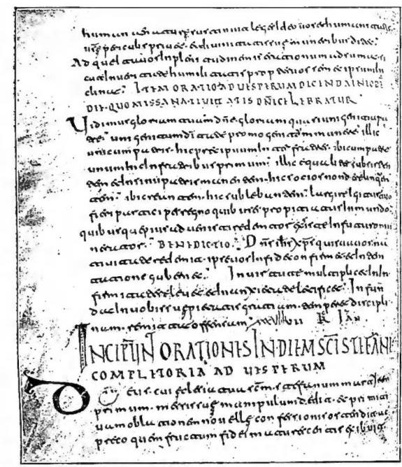
(from Ch. U. Clark, Collectanea Hispanica. Parigi 1899, plate 18)
VISIGOTHIC, WRITING AND MINIATURE - Mozarabic Orational, in Visigothic minuscule, of the formative period (early 8th century). Verona, Bibl. Cap., cod. LXXXIX (84), f. 37v.
into the 12th century. The prohibition allegedly imposed on it for liturgical texts toward the end of the 11th century, at a Council of León (Rodrigo of Toledo, De rebus Hispanica, VI, chap. 29, in Patrum Toletanorum quotquot extant opera, III, Madrid 1793, p. 143), is controversial.
The following may be considered characteristic letters: a, open as in cursive minuscule and in other scripts directly derived from it (Merovingian, certain pre-Carolingian scripts), but with a more pronounced separation of the strokes in the upper part, so that it closely resembles u, from which it is distinguished only by its termination with a curved stroke toward the right which, within the body of the word, serves as a ligature with the following letter; in cursive it is often found raised above the line and arranged along an oblique axis; g, in majuscule form and with a tail descending far below the line; t, with a closed loop on the left, which opens the letter’s stroke and is written from top to bottom in a counterclockwise direction (in ligature, however, it assumes different forms). In cursive, the um nexus at the end of a word is also characteristic. Also noteworthy, though not exclusive to Visigothic writing, are the double form of d (uncial and minuscule); e, resembling an e, sometimes also with its upper loop closed and, in ligature, rising above the other letters; i, in a tall or short form depending on whether it occurs at the beginning of a word or not, or whether it has a semivocalic or vocalic sound (this rule is not, however, always observed); in ligature with a preceding t, between the end of the 9th century and the beginning of the 10th, the rule was established of extending i below the line when it had a sibilant sound; u, especially between vowels, sometimes reduced in size and superscript. Visigothic writing also has its own majuscule alphabet derived from the capital alphabet, in which Arab influence is particularly recognizable; it is used in titles and, more rarely, in initials. Characteristics of the manuscripts of the Iberian Peninsula, rather than of Visigothic writing, should be considered the special ligature of K, P, and T, for caput, at the beginning of chapters, and the special use of certain abbreviations (frequent omission of vowels in contraction, the abbreviations of «per» and «qui» expressed by a sign that intersects the letters p and q respectively in a manner similar to that used in other scripts for the abbreviations of «pro» and «quod», etc.).
The criteria for dating, formulated rather generically by Loew, are purely indicative: the period of perfection would fall in the 10th and 11th centuries.
Miniature. - Visigothic miniature, or rather the miniature of Spanish manuscripts from the 7th to the 11th century, may be divided into two periods. The first extends to the end of the 9th century and is characterized by rather sparse ornamental motifs, limited to titles and initials (the exception of the Ashburnham codex of the Pentateuch, now in the National Library of Paris, which dates from the 7th century and contains very rich illustrations, must be considered separately, since it derives from a classical model). In the second period, ornamentation gradually becomes more abundant and refined, progressing from still simple, monochrome or bichrome decorative elements, sometimes enriched by a very fine pen arabesque (second half of the 9th century), to the use of polychrome borders and initials, complicated by rather crude interlacings (10th century), and finally to a more elaborate development of the same interlacings with floral and zoomorphic motifs (11th century).
In the compositional scenes, a sharp contrast may be observed between the skilful distribution of the figures and the crude execution of the drawing: the human figure in particular is treated with evident awkwardness; Arab influence is recognizable in the architectural forms. The juxtaposition of colors is always violent: yellow predominates over green, blue, and red. In the Catalan codices, however, the influence of French schools modifies these characteristics as early as the 9th century. Besides those reproduced here, cf. the illustrations in vol. III, col. 1605 (Visigothic minuscule); vol. V, col. 463 (Visigothic cursive); vol. VII, col. 1240 (Visigothic minuscule); vol. VIII, pl. C (Visigothic minuscule). - Vedi pl. CXLIX.